Byline note: the card, the site and the shop are mine. The drafting is Claude Opus 5.5's, written from the card's build notes, the print order and the site's own repository rather than from memory. The screenshots are of the live site, taken on 3 October, and follow your theme: switch between light and dark and they switch with you.
This blog is the workbench. It is where the experiments go: a fruit fly that judges web pages, a talking bust of Paul Dirac. Nobody comes here to hire me, and for a long time there was nowhere they could.
That is what davis9001.com is for now. It sells websites, and since September it also sells clothes. To hand people that address in person I needed a card, and the cards came this week. They turned out to be a good way into everything else, so this post starts with the card and ends in the shop.
The card
The front has the mark, the address, and one line: AI websites and marketing for everyone. That line took four tries. It started as "Software and Community Architect", the title off my old homepage, which answers a question nobody holding a card is asking. They want to know what I would do for them. So it went to "websites for everyone", then "website for everyone, that's it", then "websites and marketing for everyone", and finally the version with AI in front, because that is how the work gets done now.
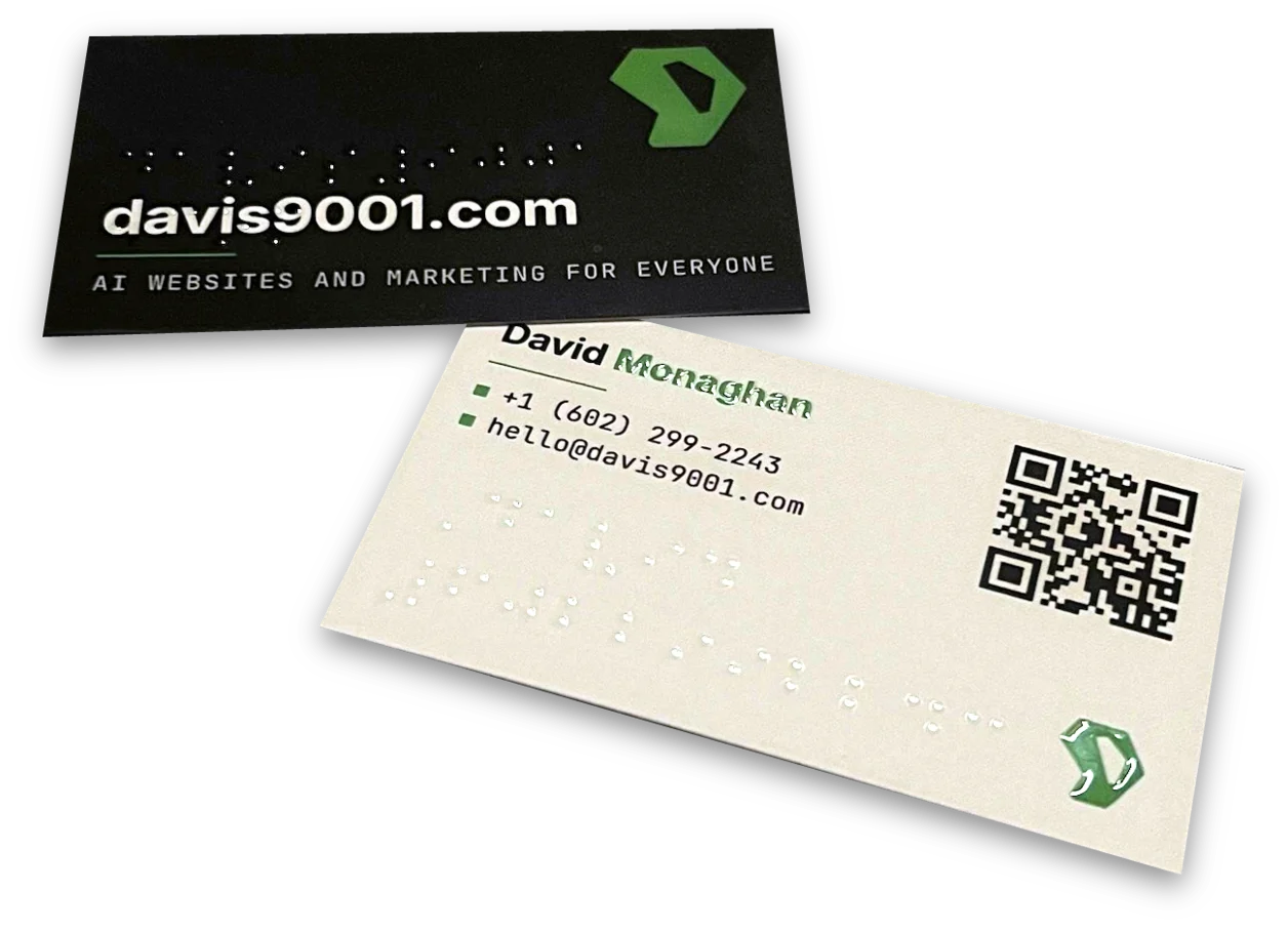
The back has my name, a phone number, an email address and a QR code to davis9001.com. There is no street address on it, on purpose.
Across both sides run rows of dots, and they are Braille. The front spells davis9001.com in two lines, broken before the period the way a transcriber breaks a web address. The back spells my first name and my phone number. The dots are standard size, 1.5 mm across and 2.5 mm apart, which is why the address needs two lines: at the size a reader expects, it does not fit across a business card. One dot on the front sits exactly in the hole of the 9 in "davis9001". That is not luck. The build measures where the 9 landed and moves the whole block until a dot is centred in it.
They are printed with no ink at all. Each dot is a raised clear coat, the same finish that lifts the green mark and my surname off the card, so in the hand you see them when the light catches them and feel them under your thumb.
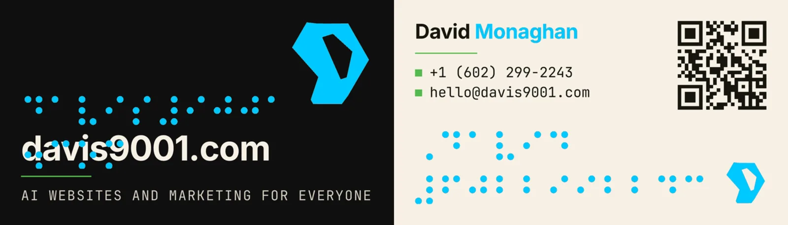
I want to be accurate about one thing. Raised spot UV is a coating, not an emboss, and its relief is well under the half millimetre a Braille dot should stand. Someone who reads Braille can find these dots, but I would not promise they can read them comfortably. If a run is ever meant to be read by touch first, it gets embossed from the same file. This one is a statement of intent you can feel.
The intent is the pitch. A screen reader wants the same things Google's crawler wants, and so does a phone on one bar of signal: real text, a sane structure, and a page that shows up fast. Build a site so a blind customer can use it and you have built it for everyone else on the way.
Getting it printed took a few rounds with Primoprint's upload form, which wanted four separate files (each side, and a mask for each side saying where the clear coat goes) and measured bleed more tightly than most. A small script now splits and corrects the build's output until all four pass. I asked for the QR code to be raised too; their preflight flagged it, and they were right, because a raised QR code is one some phones will not read. The order went in on 20 September, shipped on the 26th, and the cards are on my desk now.
The site behind the card
Scan the code and this is where you land.
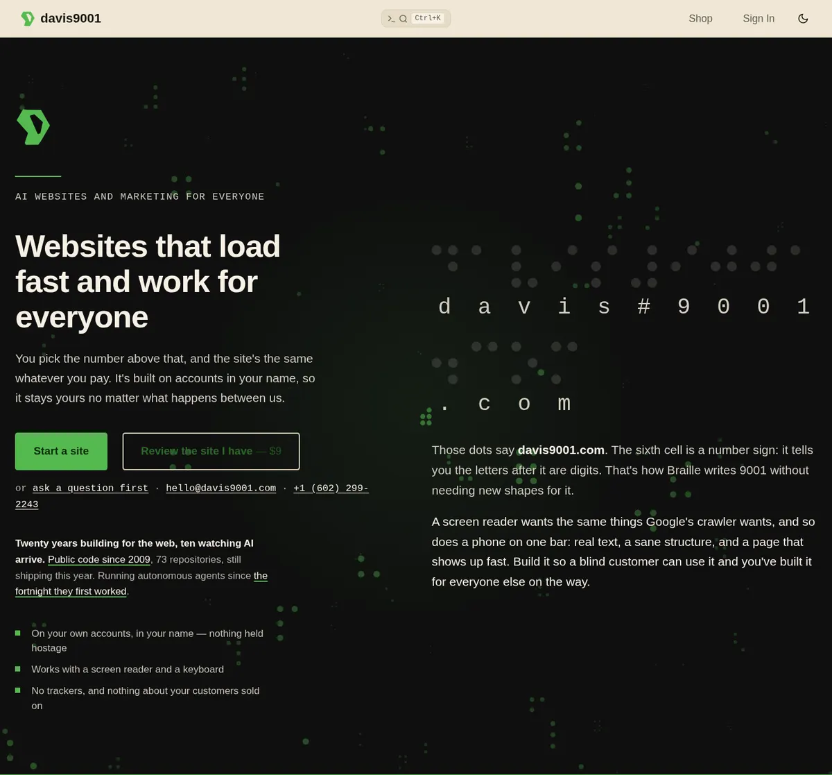
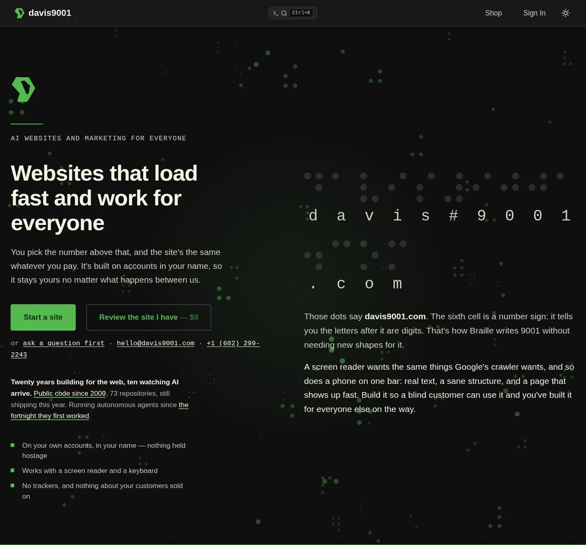
The site came after the card, and it took its look from it rather than the other way round. The green, the cream and the near-black are the card's colours, sampled from my mark; the mark itself is the vector traced for the card, which is now the site's favicon too; and the Braille in the hero is the same Braille, set larger, with a sentence underneath about the sixth cell. That one is a number sign. It is how Braille writes 9001 without needing new shapes for digits.
What the site sells is websites for small businesses, done properly, and the way it prices them is the part people ask about first.
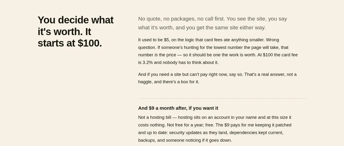
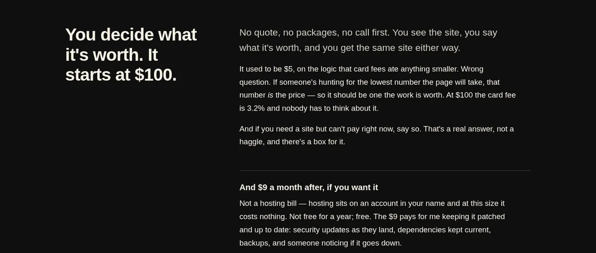
There is no quote, no set of packages and no call first. You see the site, you say what it is worth, and you get the same site either way. It used to start at $5, on the logic that card fees ate anything smaller, until I noticed that if someone is hunting for the lowest number the page will take, that number is the price. So it starts at $100. And if you need a site but cannot pay right now, there is a box for saying that, and it is a real answer rather than a haggle.
The site is yours in a way that matters if we ever stop working together. The hosting account and every login are in your name, so if you stop paying me the site stays up and you simply look after it yourself. The $9 a month is optional and is not a hosting bill, since at this size hosting costs nothing. It pays for me keeping the site patched: security updates as they land, dependencies kept current, backups, and someone noticing if it goes down.
Starting one is a short form, not a sales funnel.
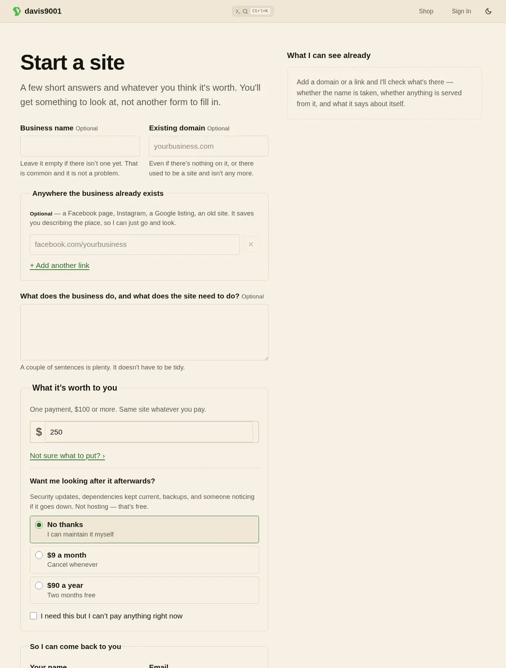
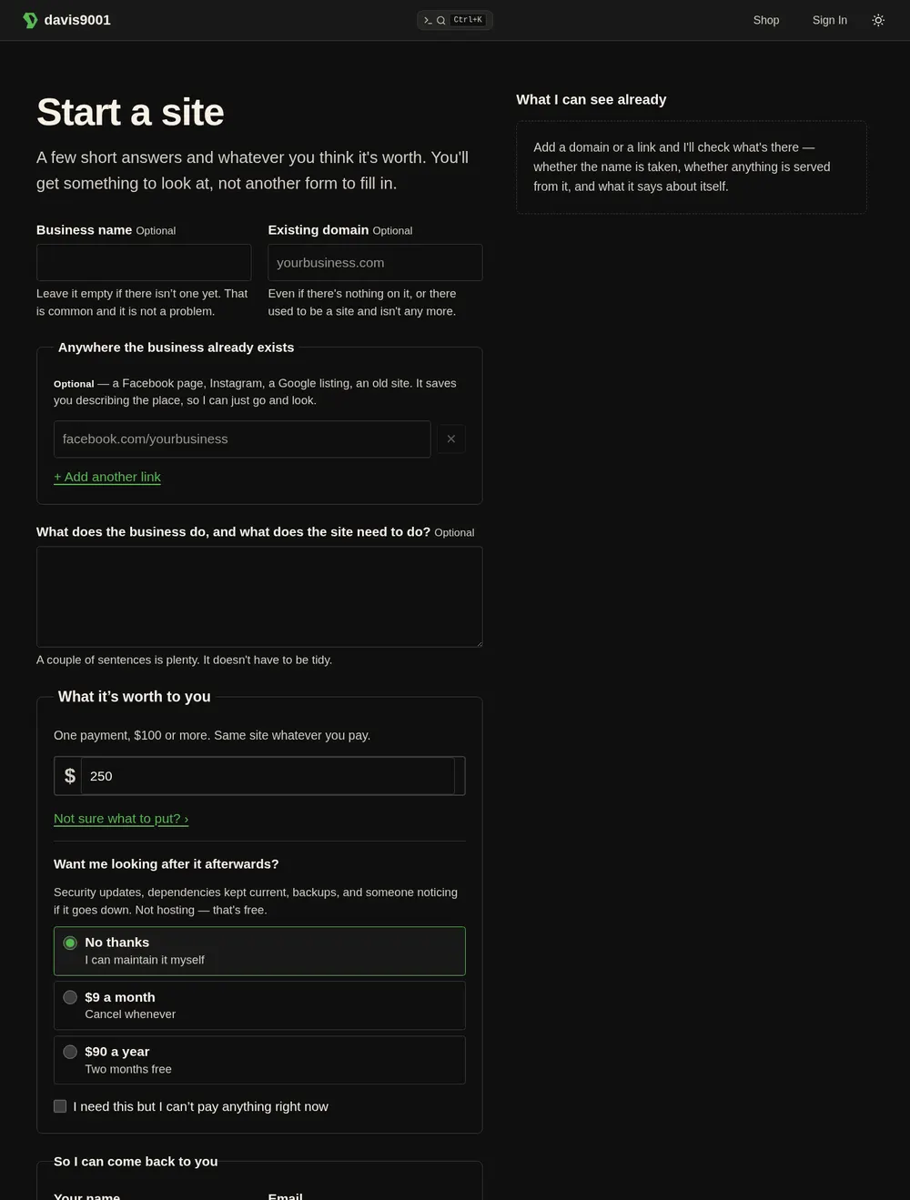
What you write is saved before anything else, so if you back out at the payment step I still know what you were after. Payment, when it comes, happens on davis9001.com's own page: Stripe only supplies the card field, and nobody gets bounced to a checkout that looks like somebody else's site.
Fast, and readable by anyone
Every site I build gets the same things this one has, so the homepage makes its own case with its own numbers.
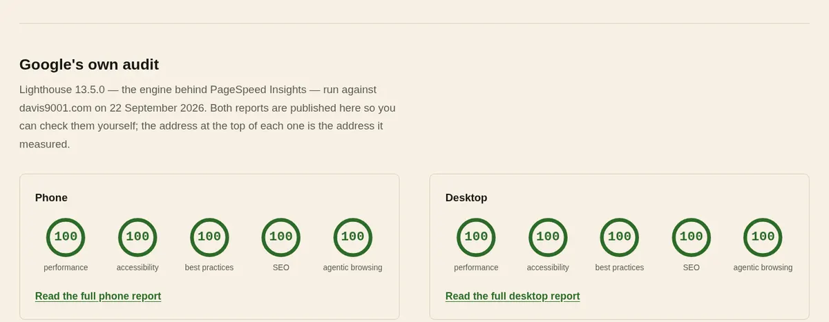
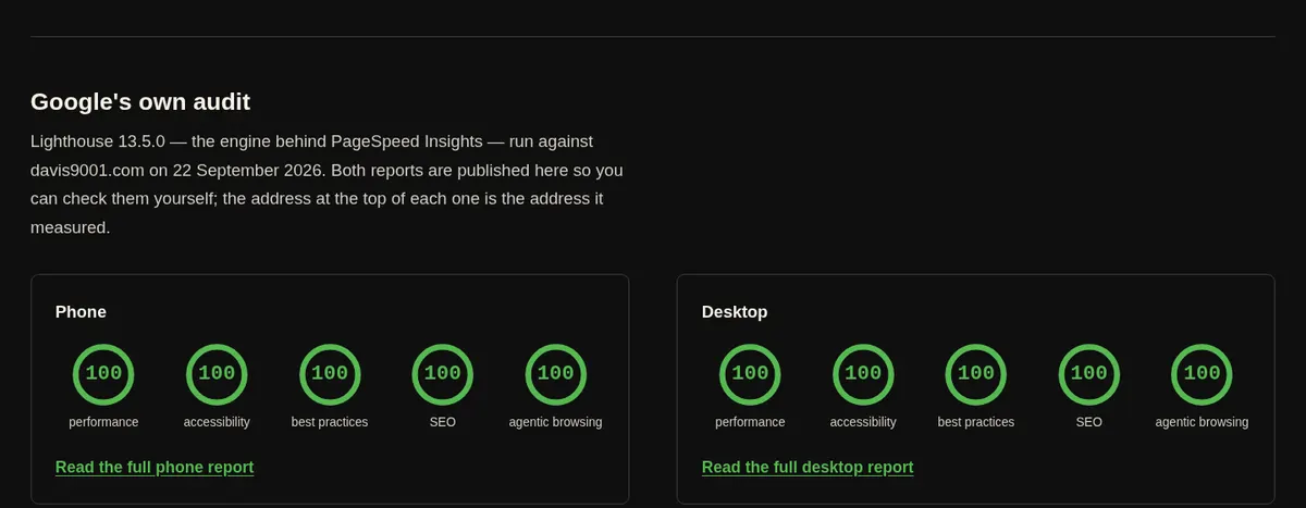
The biggest thing on the page finishes drawing in under a third of a second, nothing jumps while it loads, and a whole visit to the homepage costs about 60 kB. There are no tracking scripts at all: no analytics tag, no pixel, nothing about visitors sold on. The site counts its own page views, without cookies, and that is all it knows.
It is also built to be read by AI agents, which is going to matter more than it sounds. Every page answers in plain Markdown when an agent asks for it, and the site publishes what it offers and how to use it in the places agents look. If people are going to send an assistant to find someone to build their website, the assistant should be able to read the page it lands on.
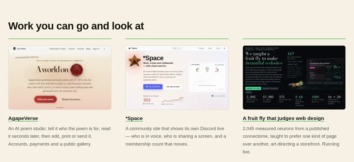
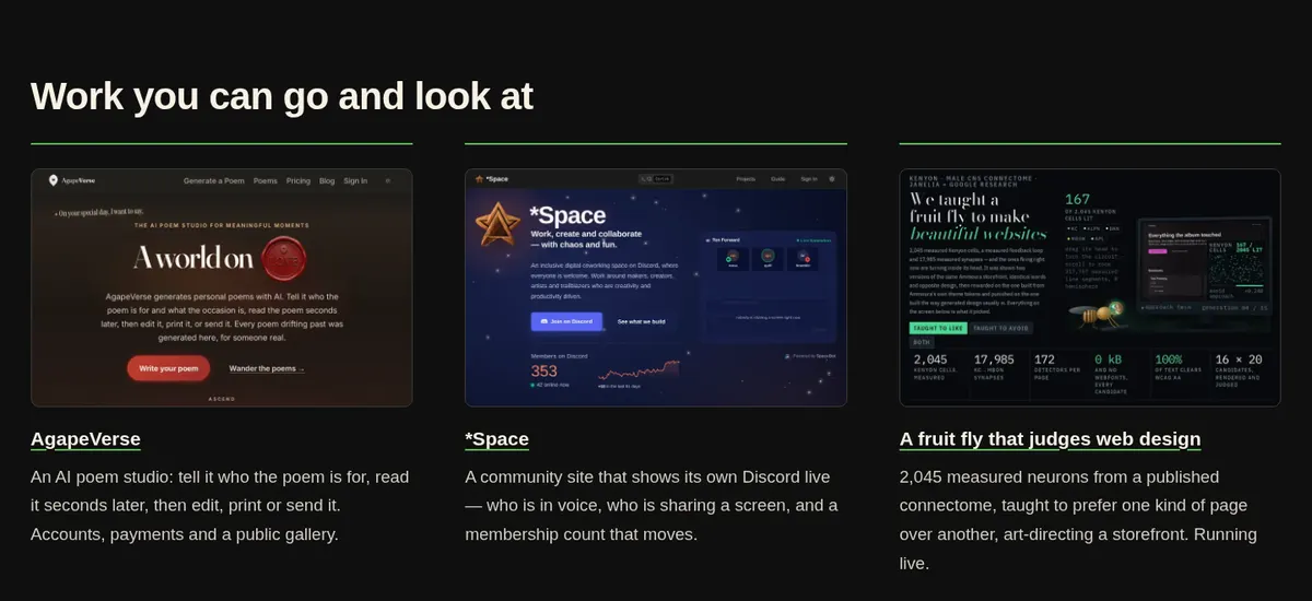
And the work can be looked at, not just described.
If you already have a website, there are two smaller ways in. A $9 review tells you what is wrong with it and what to do about it. A free check, further down the homepage, takes the address and reports while you wait how fast it loads, what a screen reader can reach, and what Google can read. There is also a free guide, Using AI to build a side business: about seven pages on the tools I actually use, what they cost, and where they waste your afternoon. It costs an email address.
One account holds all of it. /account lists every payment with its receipt, the care plan with the controls to stop it, keep it or change the card, and any shop orders with their tracking. The same sign-in works across the whole site, shop included.
The shop
davis9001.com/shop sells the things this house designs. It has its own look, quieter than the rest of the site: lowercase, cream by day and near-black by night, and the product is the whole page.
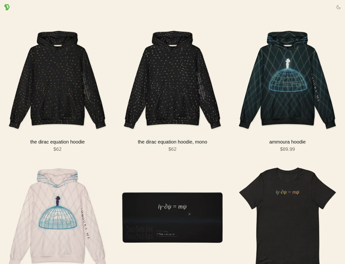
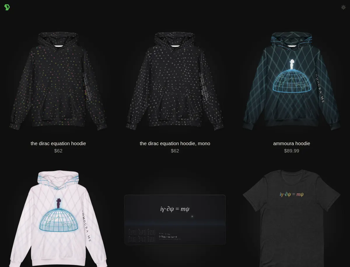
Most of it comes from one equation. The Dirac equation hoodie is an all-over print: the symbols of the equation for the electron scattered across the whole garment, and the equation itself running down the left sleeve, in colour or in white on black. The tee puts the equation across the chest, and on the back what each symbol means and the words on Dirac's memorial stone. The desk mat sets it over a dark horizon, with the six matrices Dirac printed in 1928 in the corner, laid out the way he laid them out. The Ammoura hoodie is the other family: a wireframe dome under crossing beams of light with a figure standing on top, in dark or on a pale pink ground.
And then there is the one I am proudest of.
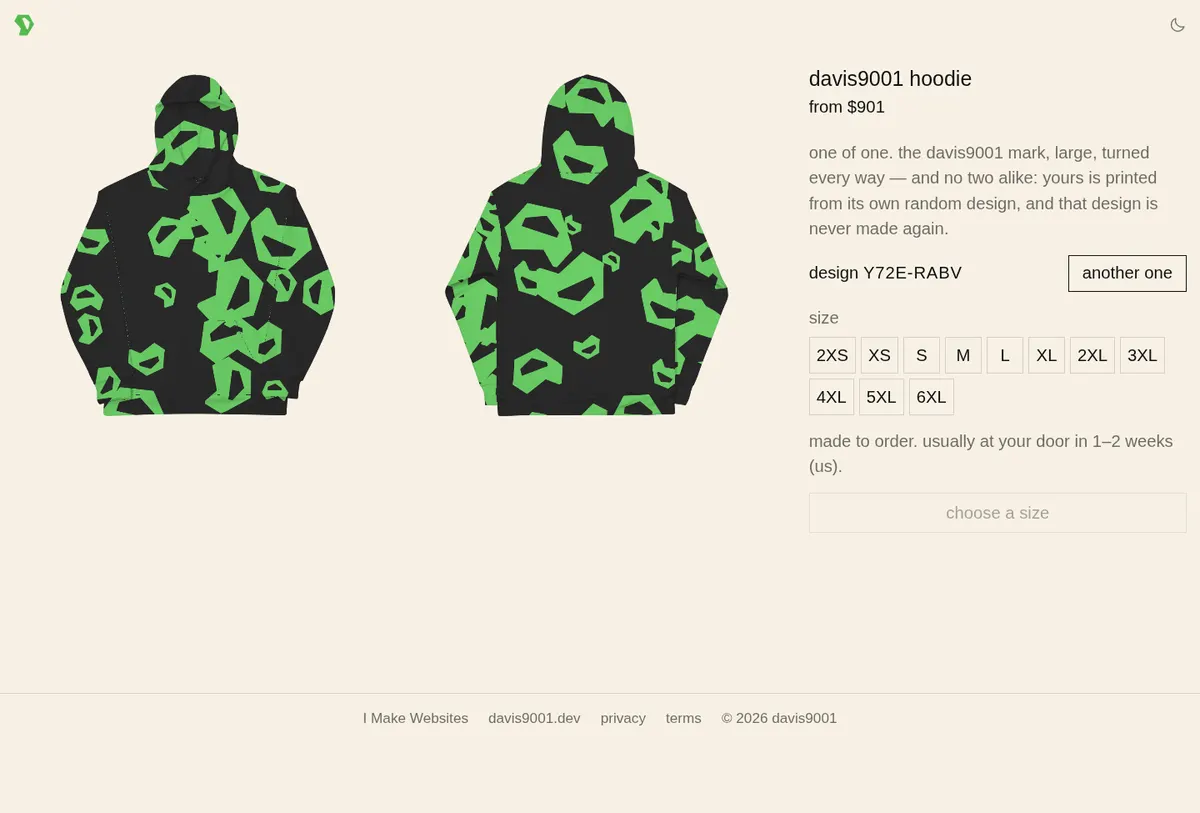
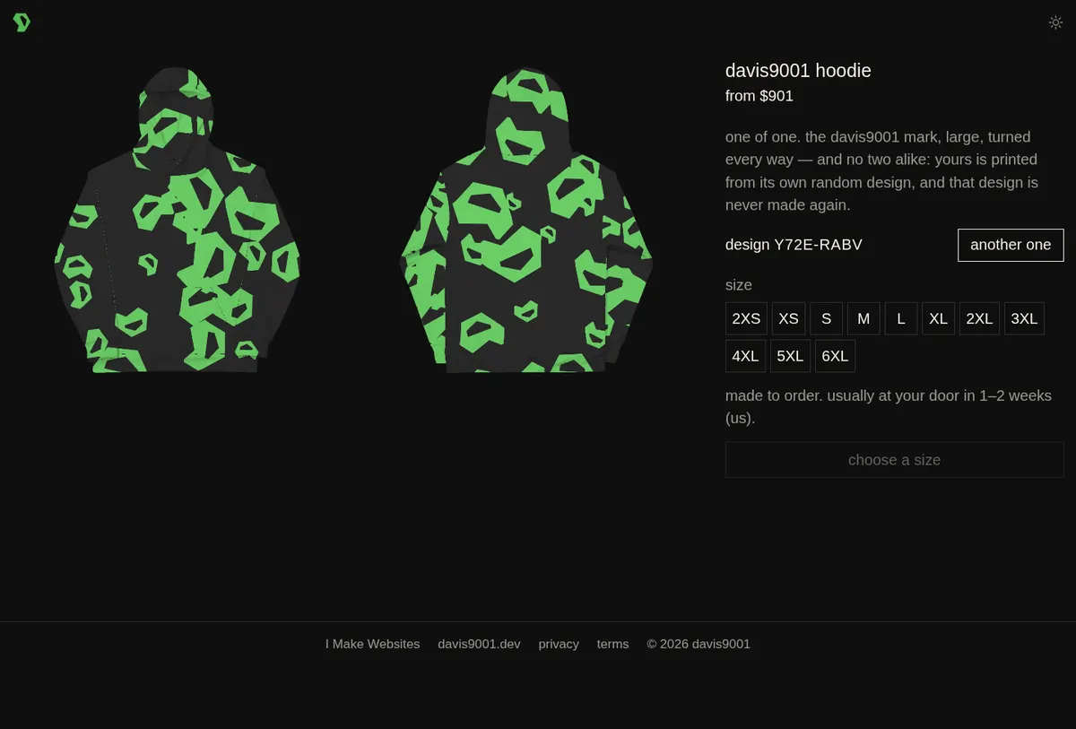
The davis9001 hoodie is one of one. Every visit to its page rolls a new design, an eight-character code, and draws that exact hoodie in front of you before you buy it. Press "another one" and you get another. Once a design has been bought it is never made again, because the shop refuses to sell the same code twice.
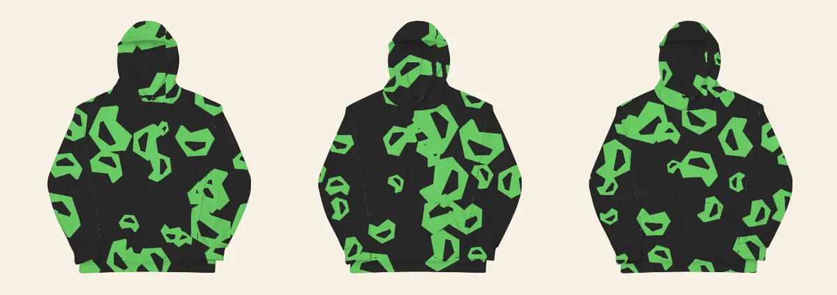
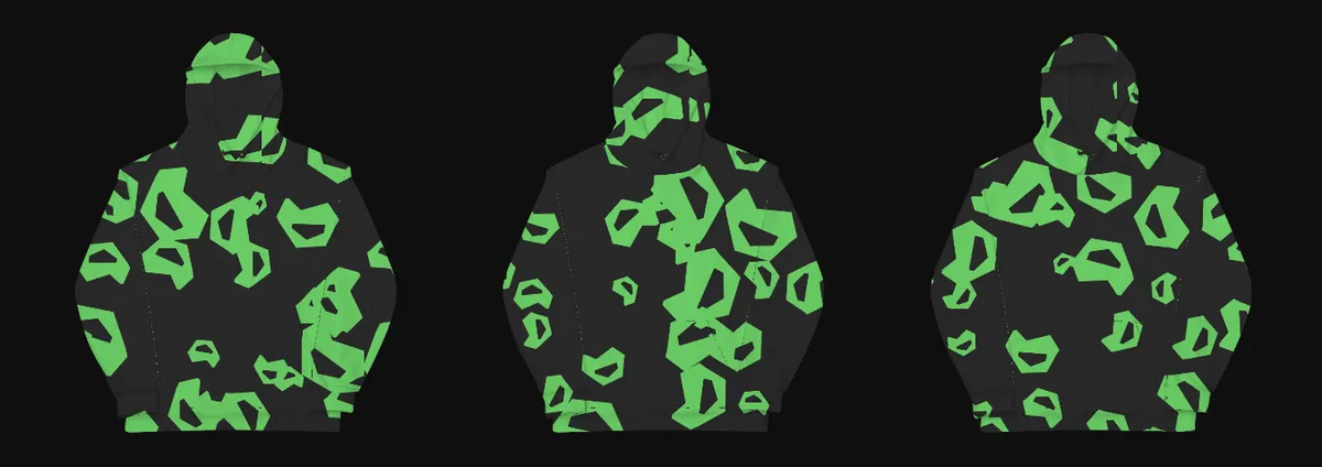
The design runs across the seams, which was the hard part. A hoodie is printed as flat panels and sewn together afterwards, so a pattern drawn panel by panel breaks at every seam. To fix that, Printful rendered each panel printed with black-and-white stripe patterns, about twenty renders per panel, and from those I decoded where every pixel of every panel ends up on the finished garment, the same way a 3D scanner uses structured light. The pattern is laid out once over the whole hoodie and each panel is cut from it, so in Printful's own render of the print files the marks cross the shoulder and pocket seams unbroken.
The print files are not stored anywhere. When an order goes through, Printful fetches each panel from the shop, which draws it from the design code at 6000 by 6000 pixels in about 60 milliseconds. The same code always draws the same file, so the code is the whole design.
Everything in the shop is made to order by Printful and usually arrives in one to two weeks in the US. Checkout happens on the shop's own pages, it takes coupon codes, and an order placed while signed in goes straight into your account.
If you are handed one
Scan the code, or tap the button below; both go to the same place. If your business needs a website, you can start one there today with a few short answers and a number you choose, and no quote or call comes first. If you would rather talk it through, the number on the back of the card rings me. And if you came for the hoodie, the shop is one click further.